Chapter 3 - My First Dashboard
We crawl before we walk.
Congratulations on making this far!
If my wishful thinking calculations are correct, I managed to get 100% of the readers who started reading this substack to create an account with Dune and hitting the ‘Run’ button at least once!
If you are still sitting on the fence, go register and account here, it’s time to stop overthinking and to come play with the big boys.
Baby dashboard
If you have read Chapter 1 and Chapter 2 you have actually mastered the ABCs and 123s of SQL querying and blockchain data analytics.
While it is not enough to write poems and make ground breaking dissertations, you now know enough to make the metaphorical equivalent of a macaroni necklace.
Now, let’s get you some glue and paper.
Measure Twice, Cut Once
If you feel like going wild, go for it! This is how I actually learned. After all, we each have our own learning processes.
But if you feel a little less adventurous and want hand hold for a bit longer, it’s also fine.
I personally use Milanote when I am contemplating a dashboard, it helps me get my thoughts in order and avoid style drifting (even though nothing ever goes according to plan).
Here is the link to the Milanote board that I used for the baby dashboard project.
Writing up our objectives
Given that our arsenal is quite limited, we will kinda have to reverse engineer our objectives based on the macaroni and glue that is on our figurative table.
Anyhow, let’s try our best to make something that we can be proud of.
For our baby dashboard, let’s try to:
Show the evolution of the price of Uniswap token($UNI) from the 1st of January 2022 to the 31st of January 2022; and
Highlight the highest and lowest price that $UNI has reached in that time period.
Picking up some Media
A dashboard is not all just numbers and charts, you need both pictures and text to be able convey the message in your head.
For this baby dashboard, let’s use a baby unicorn, perfect for Uniswap dashboard!
Let’s roll up our sleeves
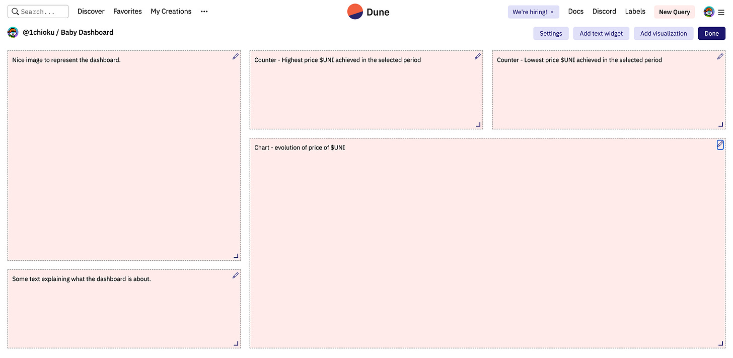
Drawing up the dashboard plan
I always like to start drawing up the plan for my dashboards first, it’s an excellent way of visualising what needs to be done.
In the dashboard plan I added using the ‘Add text widget’ button:
An image placeholder;
A text placeholder;
2 counter placeholders; and
A chart placeholder.
The button below is very helpful in knowing how to format a text widget box:
So let’s start by adding the image:
And some text as well.
Objective 1 - Evolution of the price of $UNI
This query is fairly straightforward if you have been following Chapter 2.
SELECT
    minute,
    symbol,
    price
FROM prices.usd
WHERE symbol = 'UNI'
AND minute >= '2022-01-01 00:00'
AND minute <= '2022-01-31 23:59'
ORDER BY price DESC
Link to actual query here.
A few explanatory on the query:
We are choosing
minute,symbol, andpricewhich are the 3 data columns we need.prices.usdis the data table we are fetching the data from, same as Chapter 2.WHERE symbol = 'UNI'only shows data where thesymbolis UNI.AND minute >= '2022-01-01 00:00'andAND minute <= '2022-01-31 23:59'only shows the rows which are between the time period we need the data for.
ORDER BY "price" DESCThis last command instructs the query table to display all the data by sorting it by price from largest to smallest. We will get back to that specific part in the second objective below, you can ignore that for now.
Hit the ‘Run’ button and here we go:
Now for some visualisation magic:
And here we go!
Objective 2 - Highest and lowest prices
Normally you could have run 2 more separate queries to get the highest and lowest prices of $UNI during the designated time period.
However a good programmer knows how to do the most work with the least effort, which is why we used the additional command below:
ORDER BY price DESCBecause the graph maps the minute and price like a cartesian map, we don’t need for that data to be ordered.
So we use the ordering system to get the highest and lowest price in an already ordered fashion for us to pick up.
Let’s create two new visualisation, this time we use counters (it’s a visualisation that shows a single data point).
See what we did there?
We used the fist row (1) to get the highest price in the period, and the last row (44640) to get the lowest price in the period!
Ta da!
Let’s insert those visualisations, and our baby dashboard is up and running.
I’m ready for big boy toys!


